1. Introduction

I have fond memories of playing the Hot & Cold game as a kid. Perhaps you do, too - hiding a tiny object somewhere in the house and asking your siblings and friends to find it within a short time frame.
Upon being asked by the seeker, the hider has to give a verbal cue such as 'Hot', 'Very Hot', 'Cold', 'Very Very Cold', and so on to signal the seeker's 'proximity' to the hidden object - hot implying Near and cold implying Far. The joy derived from hiding the object securely or spotting it within the stipulated time frame was immense! The seeker would also vehemently protest if he/she found the hider's proximity cue to be false or misleading😁.
In this post, I will demonstrate a real-world application of the Hot and Cold technique - one which makes use of statistical cues. To perform Spatiotemporal Analysis of Road Crashes in Brevard County in Florida, USA, I've used Esri's ArcGIS Pro - an advanced Location Analytics (GIS) software platform.
Much thanks to Lauren Scott Griffith & Lixin Huang for developing the tutorial on this topic on Esri Learn ArcGIS website.
SECTION HYPERLINKS:
I have attempted to elaborate the demonstration in a detailed, step-by-step manner in this post and highly recommend that you read it. If, however, you prefer to see a clip of the technology-at-work (less-detailed), here is a 16-minute video demonstration -
Video 1: Walkthrough on deploying Location Analytics on Vehicle Crash Records
Spatiotemporal Analysis is a powerful way of making sense of Location Datasets - the data can be dissected in both its spatial (positional) and temporal (time) form simultaneously. While I'll begin explaining the implications of this two-dimensional analysis shortly, in case you are unsure what uni-dimensional analysis entails, here are two demonstrations that would help - Spatial (Site Suitability Analysis for Wildlife Habitat) & Temporal (Detecting Ships in Suez Canal, Egypt).
For the spatiotemporal analysis of Road Crash sites, I shall make use of the 'Space Time Cube', 'Emerging Hot Spot Analysis' and 'Hot Spot Analysis (Getis-Ord Gi*)' geoprocessing tools within ArcGIS Pro software.
I'll recommend you to watch the two video guides below to obtain an understanding of the methodology involved -
Video 2: 'Space Time Cube' geoprocessing tool in Esri ArcGIS Pro explained
Video 3: 'Hot Spot Analysis' in Esri ArcGIS Pro explained
Interesting, isn't it?
2. Setting Up the Datasets & Initiating Location Analytics
At first, I will load the Location Dataset containing 100,000+ Vehicle Crash Records from 2010 to 2015 (six years) - within Brevard County in Florida, USA onto ArcGIS Pro. Aside from the positional information i.e. the exact coordinates of the Road Crash sites, several attributes pertaining to each Crash site are also present in the dataset (refer Figure 3 and Figure 4) - such as date and time of the Crash, number of Fatalities, number of Injuries, the cause of the Crash - whether the driver was under the influence of alcohol or was distracted, the prevalent weather conditions during the time of the Crash, and so on.
I believe such attributes are captured by local Law Enforcement / Police around the world and so, replicating this workflow demonstration on another location is completely possible.


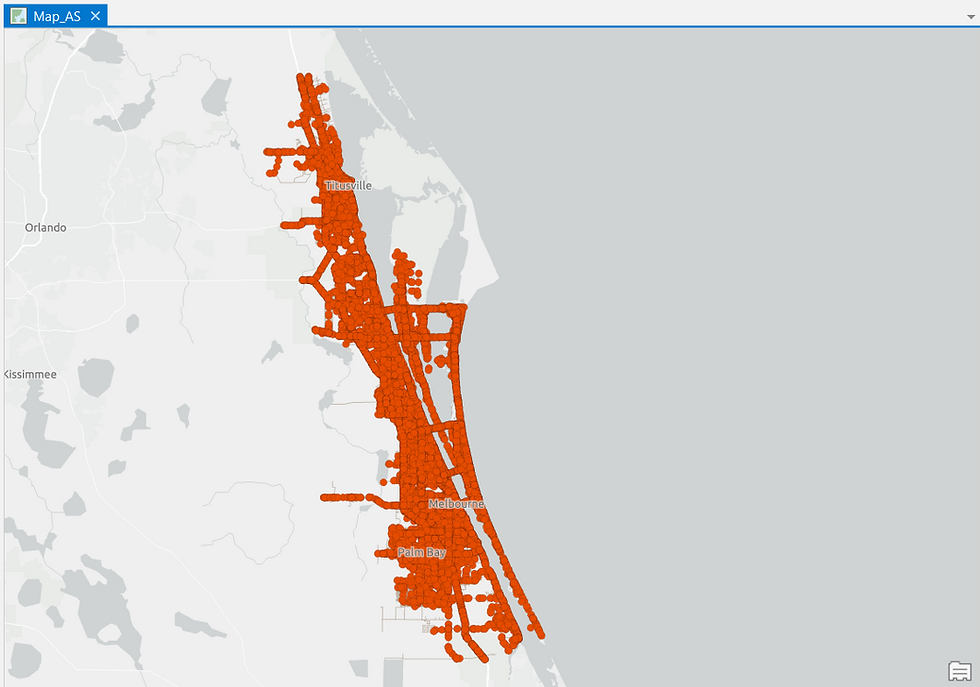
As the Road Crash dataset contains Positional information i.e. the coordinates of each Vehicle Crash site, I can plot them on a standard 2D (XY) Map -
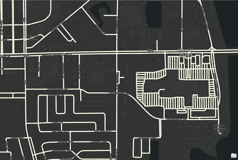
Alongside the Crash Records dataset, I possess another important and commonly available dataset - the digitized Road Network of Brevard County-
The next step involves restructuring the Crash Records dataset into a Space Time Cube format.
To explain using an analogy, just as we use Pivot Table tool in Microsoft Excel to convert raw data into a more meaningful and interpretable summary calculation, similarly, ArcGIS software is able to restructure and compartmentalize the Location Dataset into distinct Spatiotemporal buckets i.e. Bins using the Create Space Time Cube by Aggregating Points geoprocessing tool.

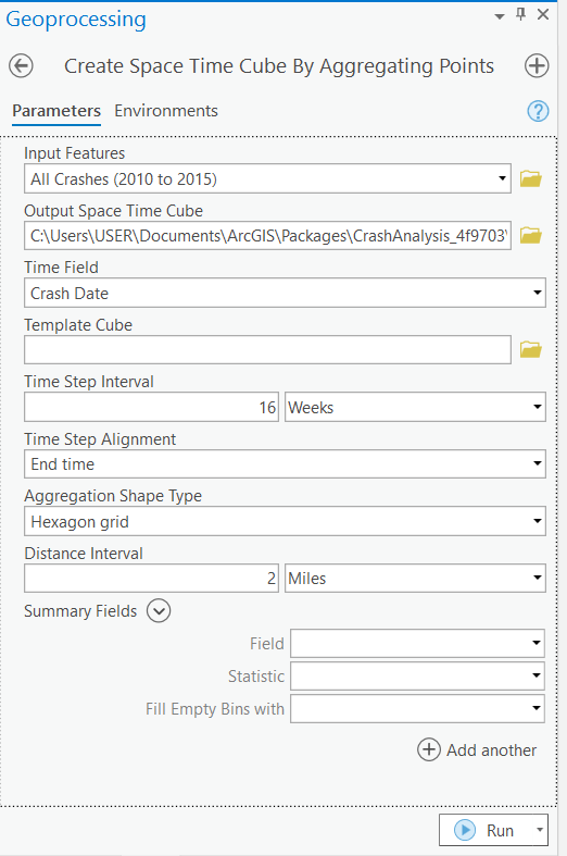
Each individual bucket i.e. 'Bin' in the Space Time Cube will aggregate information corresponding to 2 miles of territory within the county (Spatial parameter) across 16 weeks (Temporal parameter).
I have chosen not to render the output of Space Time Cube visually as it is not relevant - you can review the tool's Output Summary in Figure 9 below though. The Space Time Cube is directly saved in the system and I will use it as an input in the next step. Also, in the last phase of this demonstration, I will visually render and explain the processed Space Time Cube results in detail.
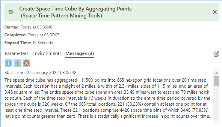
This Output Summary encapsulates how the raw Location dataset has been restructured spatiotemporally into distinct Bins.
The Space Time Cube output forms the input dataset in the next step - performing Emerging Hot Spot Analysis, also known as Space Time Pattern Mining.

Lest you think of it as so, the Emerging Hot Spot Analysis output is not a depiction of the density of Road Crashes. Rather, it is a visualization of the 'Trend' of Road Crash Density - how the Crash patterns has evolved in a Bin i.e. in a spatial cross-section over a period of time i.e. temporal.
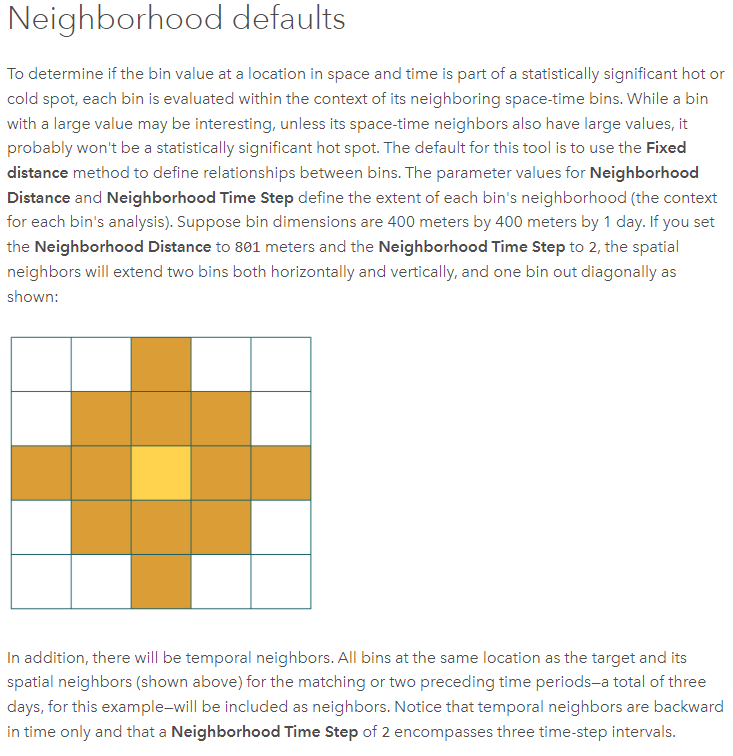
The 'Trend' computation for a Bin also takes into account i.e. is relative to the Crash Density Trends in the neighboring Bins (Spatial as well as Temporal neighbors).
Do refer the technical note for the Neighborhood Time Step concept in Figure 12.
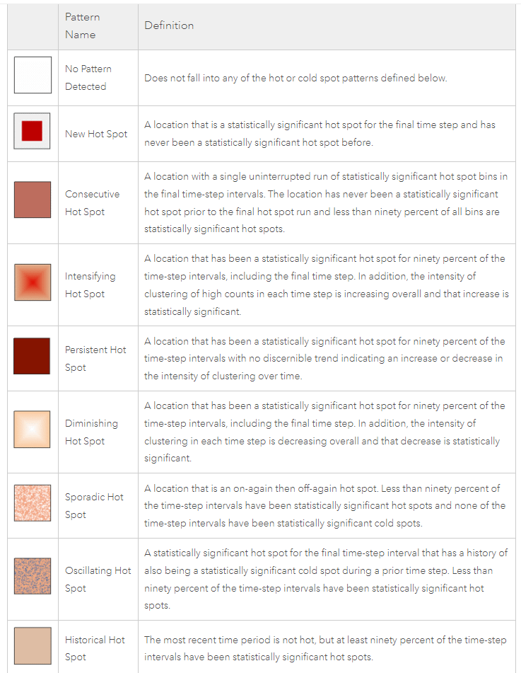
The Trend classification for a Bin will fall under one of these eight Hot or Cold Spot categories - New, Consecutive, Intensifying, Persistent, Diminishing, Sporadic, Oscillating or Historical.
The description for these are mentioned in the Infographic below-
At first, I will deploy the 'Emerging Hot Spot Analysis' tool on the Count of Total Road Crashes over a single Neighborhood Time Step.
Refer the technical note on Neighborhood Time Step below-
The output generated upon running the Emerging Hot Spot Analysis tool on the 'Count of Total Road Crashes over a single Neighborhood Time Step' is depicted below-

Alongside the map-based output, the Summary of Results table is also generated (Figure 14) which totals the Hot Spot classification for the 221 Bins in the Space Time Cube - there are 2 New Hot Spots, 17 Consecutive Hot Spots, 59 Sporadic Hot Spots, 13 Oscillating Hot Spots, 23 Persistent Cold Spots, 18 Diminishing Cold Spots and 3 Sporadic Cold Spots (Hot Spot types and their meaning is described in Figure 11). These account for 135 Bins in total - the remaining 86 Bins are neither Hot Spots or Cold Spots i.e. are statistically not significant.

The category most commonly found in the Hot Spot output is the Sporadic Hot Spot - the 59 affected Bins frequently switch between being a Hot Spot and not being one. So while we are certain that these Bins do not have any history of Cold Spots i.e. they are not completely devoid of Crash incidents, however, they do not have a clearly distinguishable Crash 'Trend' either - the statistical significance of the Hot Spots, whenever existent, is not always very high (refer the description of the Sporadic Hot Spot again if you'd like to).
As an Analyst seeking to identify risky Road Sections prone to Vehicle Crashes, it is the New (2), Persistent (0) & Intensifying (0) Hot Spot Bins that would be of primary interest to me upon running the tool.
Those who've been closely following this post thus far would have observed that I am yet to factor in Brevard County's Road Network dataset in the Space Time Cube and Emerging Hot Spot Analysis steps. Yes, you are correct: the 2 mile Distance parameter that I set prior to running the 'Emerging Hot Spot tool was Euclidean in nature i.e. based on Straight-line distance between two points. It did not represent the actual Road Distance connecting the two Bins spatially.
Therefore, as you'd agree, in order to better interpret the trend of Road Crashes for each Bin in a more accurate manner, I must factor in the Road Network layer which contains actual Road Lengths.
Before I proceed to run the Hot Spot tool factoring in the County's Road Network Dataset, I am feeling the need to clean-up the raw Crash Records dataset as I've observed the presence of misleading datapoints.
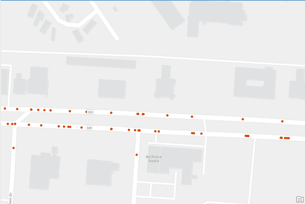
Observe in Figure 17 below that the location of some of the Crash sites (denoted by red dots) are not positioned directly on top of an existing road - rather, they are located beyond the road extent. This could be due to several reasons - it could be that the site that was recorded was where the Vehicle landed in the aftermath of the accident and not where the crash had initially occurred. Or it could also be a case of inaccurate recording due to faulty GPS and so on.
Anyways, this is a glitch and it certainly needs correction - the Crash sites must correspond to a location on the Road Network in order for the Hot Spot Tool to factor it into its calculation.


To make this correction, I will use the 'Snap' geoprocessing tool - in which I will instruct the GIS software to move any Road Crash sites that are within 0.25 miles of a nearby road to the closest point on that Road (those beyond 0.25 miles are assumed to be faulty records and will be ignored from the study).
The Snap tool successfully corrects the irregularity, as can be observed in the figure below...
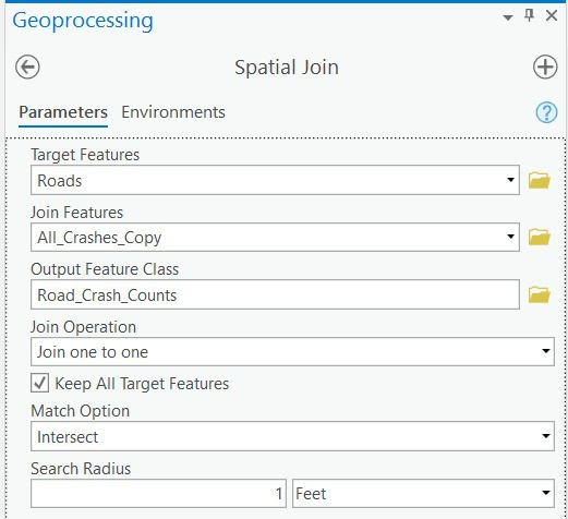
… which therefore allows me to perform the next step which is to integrate the two layers - Crash sites and Road Network seamlessly, by using the 'Spatial Join' geoprocessing tool.

As evident in the popup in Figure 21, the Road Crashes dataset is now linked to the Road Network dataset.
I am now ready to run the Hot Spot Analysis tool again...
Or am I?...
Actually, no. There is one more irregularity left to correct. Longer roads in the Road Network will naturally have more Crashes assigned to them and the Hot Spot output will be biased towards it. This isn't the right approach and will hamper the quality of analysis.
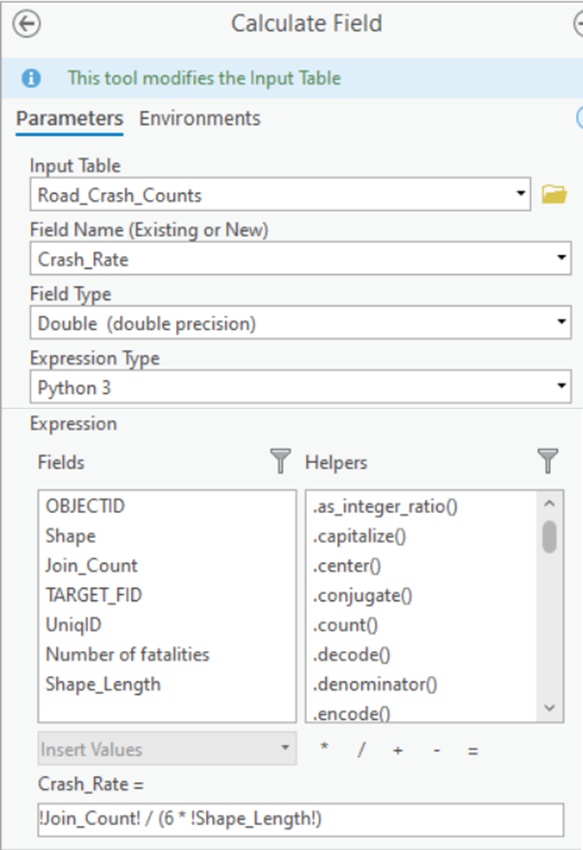
In order to rectify this implicit defect, I will compute a new field in the Road Network Dataset - 'Crash Rate per mile, per year' -
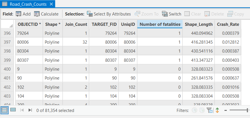
The newly computed field (Crash_Rate on the extreme right in Figure 23 below) decouples the number of Crashes (Join_Count) from the Road Length (Shape_Length) in the dataset, thereby allowing for a more accurate analysis and interpretation of Hot Spots.
3. Performing Advanced Location Analytics using Getis-Ord Gi* Hot Spot method
Now that all the irregularities are sorted, I am definitely ready to perform Hot Spot Analysis again. Just that, instead of the Emerging Hot Spot Analysis tool, I'll be using the Hot Spot Analysis (Getis-Ord Gi*) tool. The Getis-Ord Gi* statistic restricts the Hot Spot Analysis spatially to just the Road Network (Figure 26) instead of the entire Bin (Figure 13).
Prior to running the tool, I will choose to assign weightage to not just the exact spot where the Road Crash occurred but also to the entire section of the road where the Crash sequence unfolded - right from the spot where the driver would have spotted the nearing obstacle till the spot where he/she would have crashed into it - this would be the accurate 'Accident-prone Road Section'.

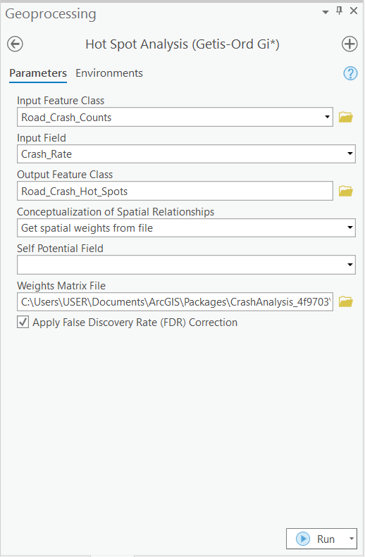
The Impedance Distance Cutoff parameter used to derive the Spatial Weights under 'Conceptualization of Spatial Relationships' in Figure 25 was 360 feet - about the length of a football field - which is the minimum stopping sight distance for a vehicle traveling at 45 miles per hour.
You may read a technical note on how to generate Spatial Weights for a Network Dataset here.
Upon running the Hot Spot Analysis (Getis-Ord Gi*) tool, let me show you a cross-section of the Map-based output below-
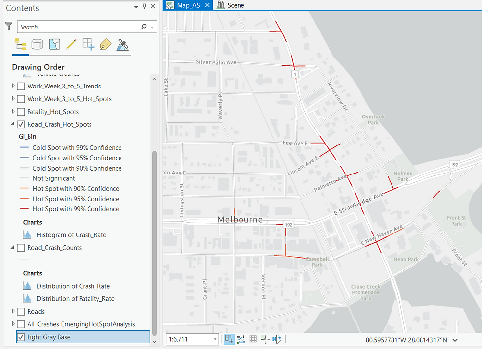
The Hot Spots are present over the Road Network now - they do not appear as hexagons - one for each Bin as they did upon running the Emerging Hot Spot Analysis tool (refer Figure 13).
Next, I'll deep dive into the analysis and perform Hot Spot Analysis using Getis-Ord Gi* method for specific Crash attributes beginning first with only those Crashes which led to Fatalities. The methodology remains the same, just that the Crash dataset is filtered to only those Vehicle Accidents which caused the demise of one or more persons.
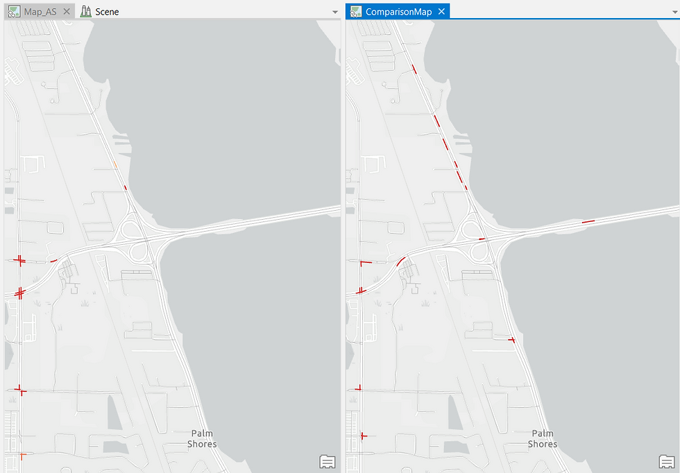
Upon running the Getis-Ord Gi* Hot Spot tool again, I was anticipating that the 'Fatality' Hot Spot output would differ from the 'All Road Crashes' Hot Spot output. And naturally, it did. The GIS software also allows me to compare both the Hot Spots outputs visually by stacking it side-by-side:

This view appears insightful - Hot Spots have emerged at new locations in the 'Fatality' output on the right in Figure 27 which the analyst must pay close attention to. You will appreciate that running the Hot Spot tool on a specific attribute (Fatality) brought to the fore certain high-risk Road Sections which were diluted in the All Crashes Hot Spot output and hence weren't visible in it.
Similarly, I will repeat the same Hot Spot Analysis and compare the 'All Crashes' Hot Spot output (left) to 'Crashes where the Driver was under the influence of Alcohol' Hot Spot output (right) -
Several new Hot Spots can be observed on the road parallel to the river in the Alcohol Hot Spot output on the right - perhaps an indication of late night Riverside partying?
I hope you can appreciate how powerful Spatiotemporal Analytics can be as it allows us to notice the effect of a specific attribute on the final outcome as well. So while the government may decide to widen the roads at Fatality-prone road sections, the police may want to crack down on Drunk driving which may be originating at the riverside pubs.
By cleaning up the data initially, I have emphasized the need for high-quality Crash Records in order to perform the Hot Spot Analysis accurately. I cannot emphasize this aspect more - organizations, especially in India, must lay stress on capturing and improving the quantity and quality of their datasets for the technology to weave its magic.
4. Automating the Workflow using Geo-Analysis Models
Such is the power of modern Location Analytics platforms that one can analyze the Crash Records much more deeply and at much faster speeds - let me demonstrate it to you.
The next question that the Analyst in you may wonder is - Which hours of the day are the Road Crashes peaking in?
GIS platforms are adept at generating Charts and Tables just like Spreadsheet software such as Microsoft Excel can - we'll use this feature to address this question. Here's a three-dimensional Line Chart that ArcGIS generated for us - it captures Crash Count, Hour of the Day, and Day of the Week.
What pattern can you observe?

Let me change the Symbology to help create a more interpretable visualization-
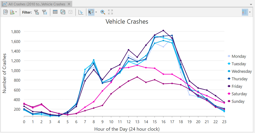
What could you assess?
A: The Crash incidents peak between 3 pm - 5 pm, particularly on Weekdays (Monday - Friday).
So now, let me restrict the next Hot Spot analysis to this newly-discovered Peak Crash timeframe - it is certain to generate new and better insights. However, instead of repeating the entire workflow one-step-at-a-time, I'll utilize a Geo-Analysis Model this time - it will allow me to replicate the entire workflow multiple times and render a meaningful output, all at the click of a button!

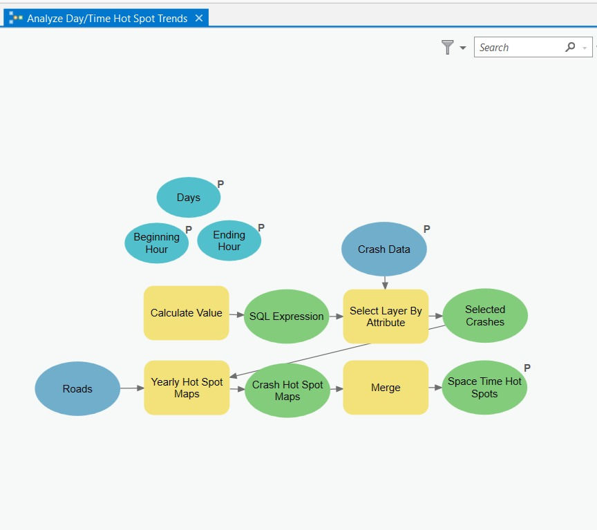
This Model (Figure 31 above) might appear complex to you at first glance, however, it is just a Graphical Codification of the step-by-step methodology that I've demonstrated earlier in the post.
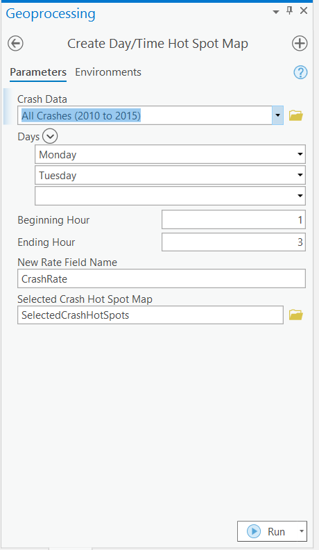
Those of you who have followed this post right from the beginning will relate to the four distinct steps that have been codified in the Model -
Step 1: Selecting the Crash points that one seeks to analyze
Step 2: Snapping the outlier Crash sites to on top of the Road Network
Step 3: Standardizing the Count of Crashes to the Road Network by computing Crash Rate per Mile per Year
Step 4: Creating a Hot-Spot Map using Hot Spot Analysis (Getis-Ord Gi*) tool
Such Models are not overly difficult to configure and may / may not require some knowledge of Coding.
That being said, having such ready-to-run Models allows an Analyst to replicate important workflows quickly, and in an error-free manner. It saves precious time as well as needless effort enabling one to perform High-end Location Analytics with a single click!
Upon running the model, I'm comparing its output - the Road Crashes Hot Spots during Peak Hours in Weekdays (right) to the All Road Crashes Hot Spots (left) in Figure 33 below -
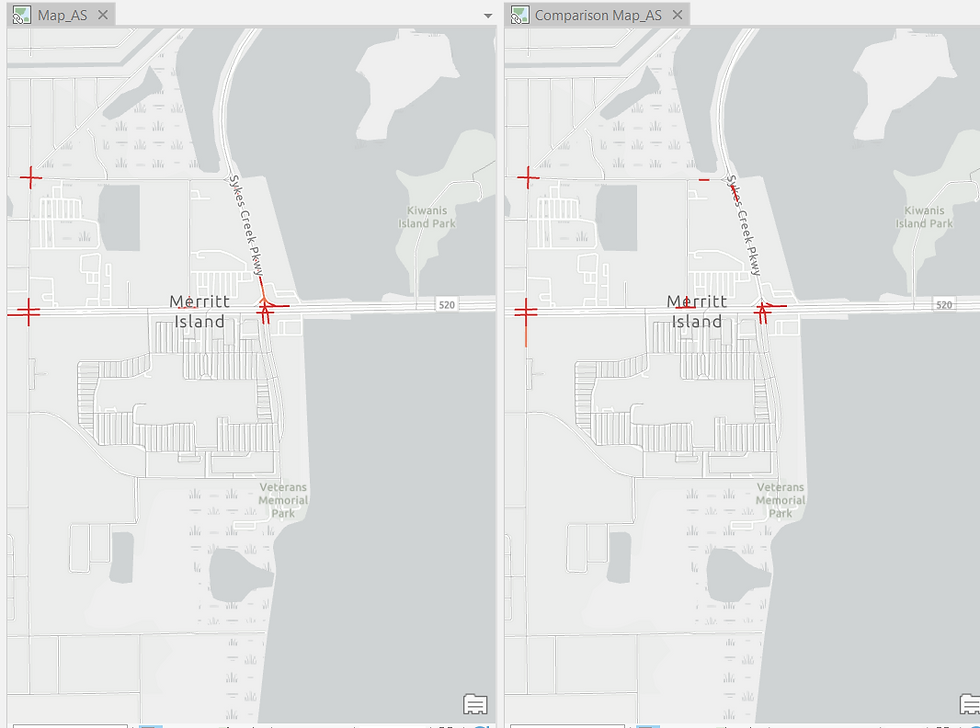
Once again, new Hot Spots have been detected and the Analyst must deep-dive into these locations to understand why they are Crash-prone Zones (maybe, they are busy commercial thoroughfares) and what can be done to make it safer (installing human traffic controllers / speed breakers / signals etc.).
5. Visualizing the Results of Spatiotemporal Analysis in a 3D Scene
Like me when I experienced it for the first time, you may be blown away by this final aspect of the demonstration - visualizing Spatiotemporal Analytics in 3D! And no, I don't mean that you need to wear 3D glasses to view this segment 😁.
So far you've been witnessing the Hot Spots on a two-dimensional (XY) map - you know that a particular location is a Hot Spot, however, you don't quite know how the Hot Spot has evolved over during the Six-year time frame of the Road Crash Records. In essence, that is the hallmark of Spatiotemporal analysis and I've kept this demonstration right at the very end for you to appreciate the true value of analyzing Crash incidents through Space and Time, simultaneously.
First, let me me create Yearly Hot Spot Maps for each of the six years (2010 - 2015). Yes, we will be utilizing a Geo-Analysis model (Figure 34 below) which will save us the labor of manually repeating the workflow six times!
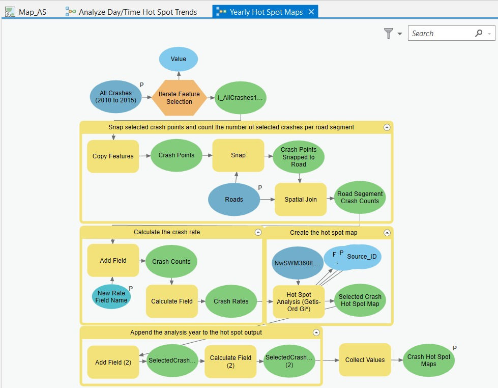
b) Next, I'll utilize a Geo-Analysis Model (Figure 34 below) which will allow me to restrict the analysis to the particular Hour & Day time-frame of my choosing - that would be the '3-5 pm during Weekdays' slot that we had previously discovered as to when the Road Crashes are peaking. The Yearly Hot Spot Maps generated from the previous step will serve as an input (the yellow 'Yearly Hot Spot Maps' input box in the last row) in this Geo-Analysis Model.
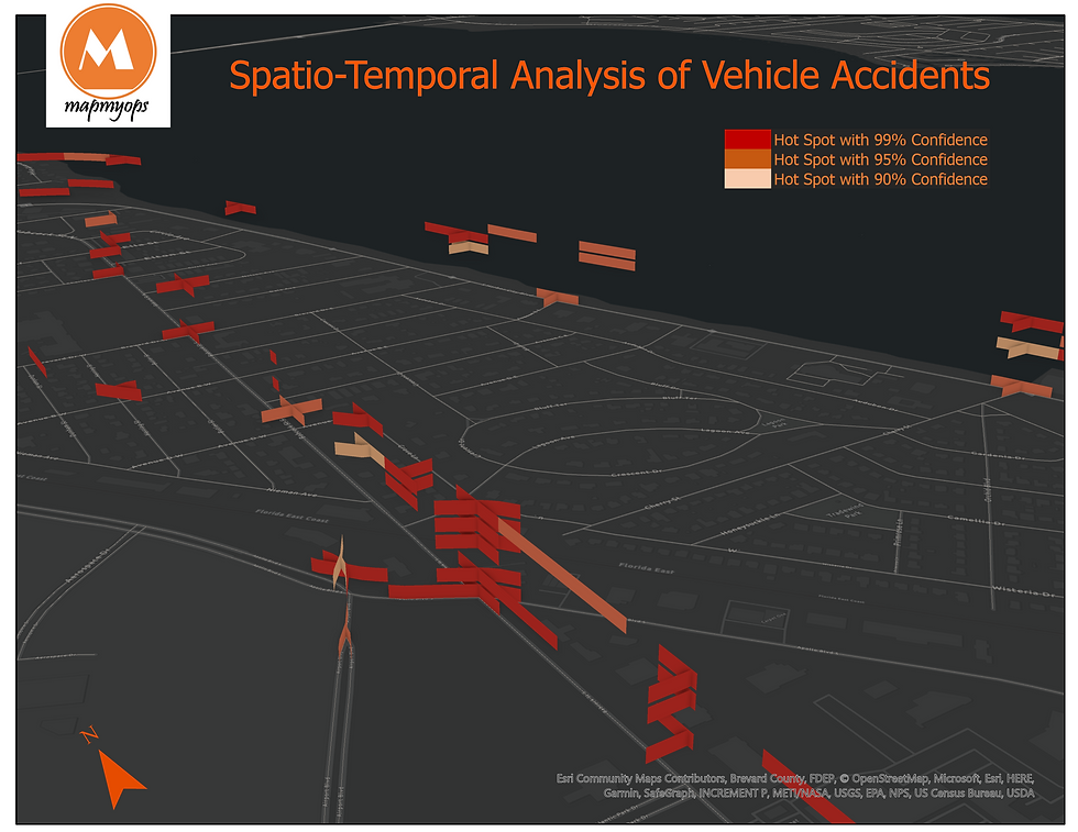
Let me reveal to you the 3D scene rendition of the 'Year-on-Year' (Temporal) Hot Spots of Road Crashes (Spatial) during 3-5 pm on Weekdays (Time frame when the Crashes have been peaking)' -
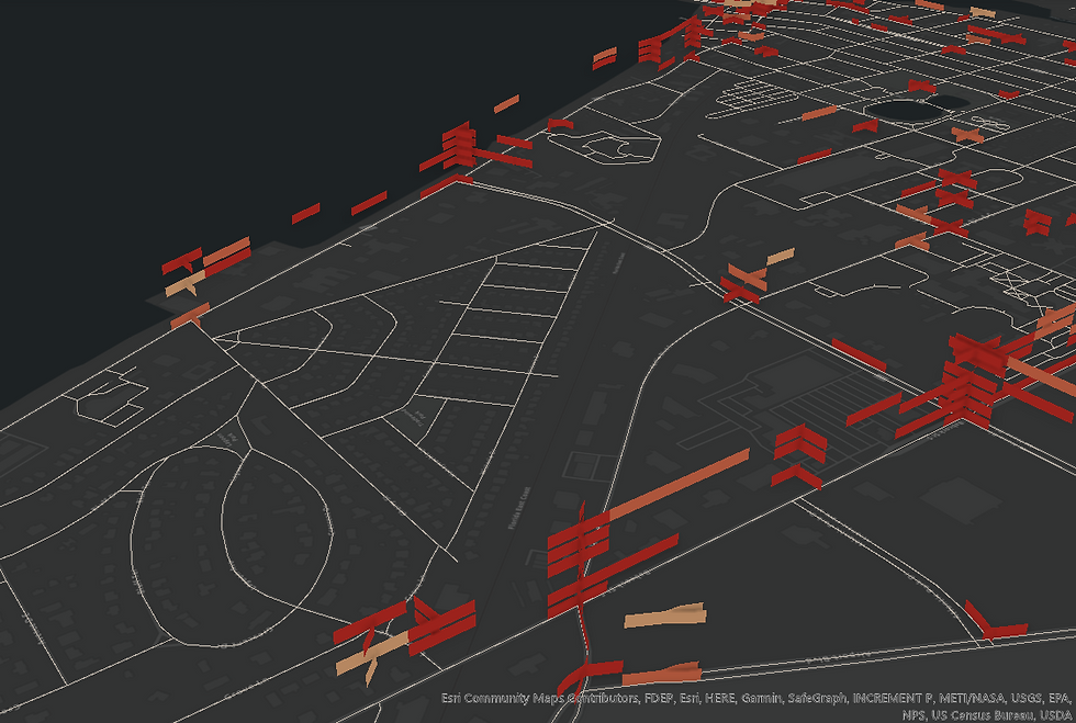
This visual (Figure 36 above) may appear daunting at first.
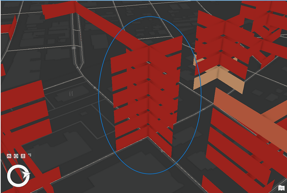
Let me explain to you what it is depicting - see the highlighted zoomed-in portion in Figure 37 below-

At the highlighted intersection on Prospect Ave road above, you are seeing a Sporadic Hot Spot (see category description).
Recollect that this type of Hot Spot was most prevalent upon running the Emerging Hot Spot Analysis tool at the initial stages of this demonstration.
The first year's (2010) Hot Spot is visualized right at the bottom - refer the Map's Legend on the left of the image - the dark red shade represents a highly Statistically Significant Hot Spot (> 99% confidence). In 2011, the second year, the Hot Spot disappears completely i.e. is Statistically not Significant, as indicated in the Legend. In the third year, 2012, the Hot Spot reappears and is Statistically Significant, albeit weaker (light red shade is representative of > 95% confidence but < 99% confidence) than the Hot Spot of 2010. In the fourth year, 2013, the Hot Spot disappears once again only to reappear with maximum intensity in the fifth year i.e. 2014. The Hot Spot disappears once again in the sixth / final year, 2015.
I hope that you have a much better understanding now as to how to interpret the Spatiotemporal Hot Spot visualization and also appreciate the benefit of of visualizing the Hot Spot evolution in a 3D Scene - XY(Spatial)+Z(Temporal).
So how would you interpret this highlighted Hot Spot stack?
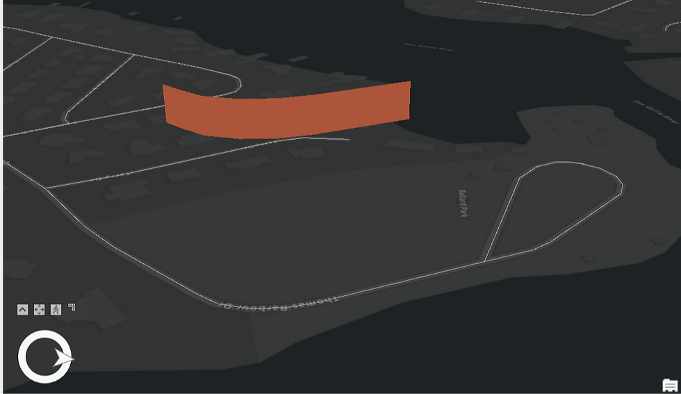
And this one?
Thank you for staying with me through this elaborate demonstration. I hope you enjoyed this spatio-temporal journey😁.
ABOUT US
Intelloc Mapping Services, Kolkata | Mapmyops.com offers Mapping services that can be integrated with Operations Planning, Design and Audit workflows. These include but are not limited to Drone Services, Subsurface Mapping Services, Location Analytics & App Development, Supply Chain Services, Remote Sensing Services and Wastewater Treatment. The services can be rendered pan-India and will aid your organization to meet its stated objectives pertaining to Operational Excellence, Sustainability and Growth.
Broadly, the firm's area of expertise can be split into two categories - Geographic Mapping and Operations Mapping. The Infographic below highlights our capabilities-

Our Mapping for Operations-themed workflow demonstrations can be accessed from the firm's Website / YouTube Channel and an overview can be obtained from this brochure. Happy to address queries and respond to documented requirements. Custom Demonstration, Training & Trials are facilitated only on a paid-basis. Looking forward to being of service.
Regards,

