

Landslide Mapping Workflows - Risk Modeling, Analysis & Detection
- Arpit Shah

- Nov 23, 2021
- 15 min read
Updated: Apr 5
Hyperlinks to Sections:
Background
While the rapid slide of a large mass of snow is termed an Avalanche - a topic that I've covered previously, the same effect on rock, debris, earth or soil is called a Landslide - a calamity that impacts us more often, and literally so.
Landslides and Avalanches are a form of Mass wasting events which entail a down-slope movement of material under the influence of gravity. Mudslide, a liquefied and swifter debris and dirt flow, is another type of Mass wasting event that is highly devastating.

Besides slope and gravity, rainfall, loose soil and ground deformation are factors that contribute towards the formation of this hazard.
Geospatial datasets pertaining to these can be obtained from topographic, aerial and satellite surveys and can be subsequently processed on GIS software for Landslide Hazard Analysis and Mapping purposes.
Landslides can be classified as per their type of movement under six broad categories: Fall, Topple, Slide, Spread, Flow and Slope Deformation (Figure 1) - this categorization was developed by geologist David Varnes in 1978, and subsequently refined by multiple researchers over the years.
India encounters several Landslide incidents - 61 have been recorded just within the first eight months of 2021. The Geological Survey of India (GSI) has indicated that about 0.42 million sq. km or 12.6% of India's land area, excluding snow-covered area, are prone to landslide hazard (!) - and to preemptively deal with it, it has created-
Region-specific Landslide Forecasting Models using Rainfall and Land Slope as central variables
Site-specific Landslide Forecasting models using advanced scientific instruments at eight sites in India as of today. GSI has indicated that 90% of the landslides occurring in India is linked to rainfall - hence, this variable is given extra weightage in their predictive models
In this post, I will demonstrate 3 workflows involving the analysis and mapping of Landslides-
Creating a Landslide Risk Model
Identifying at-risk Stakeholders and Infrastructure using the Risk Model
Rapid Detection of Landslide location using Radar Satellite Imagery
These workflows would help you obtain insights about this phenomena and more importantly, how Mapping Technology helps to manage the risks associated with it. A pictorial demonstration of all these three workflows has been compiled in the video below (I'll recommend you to continue reading the article where the subject matter is explained in greater depth and with much more clarity)-
Workflow 1: Creating a Landslide Risk Model
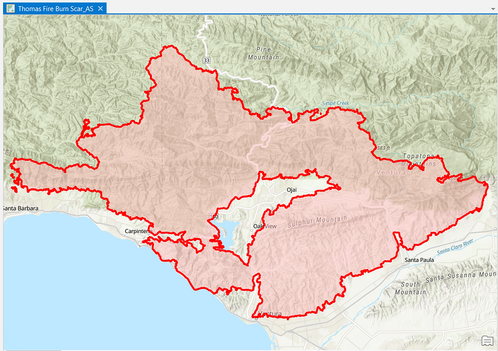
Landslide Risk models typically need to be re-evaluated after the occurrence of earthquakes, wildfires and heavy rainfall because the terrain characteristics tend to change after such major events making certain regions more susceptible to Landslides. In this workflow, I will demonstrate the creation of a new Landslide Risk Model for a region after the occurence of a wildfire within-
(Much thanks to Learn ArcGIS for the training resources)


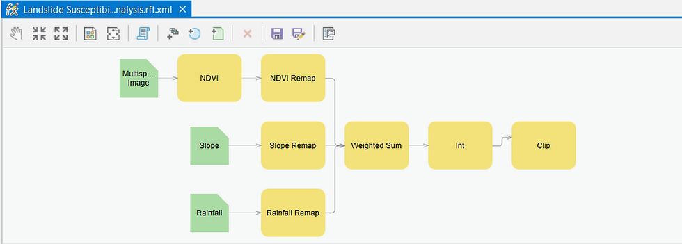
Now I will proceed to create a Geoprocessing Graph - as depicted in Figure 7 - which is essentially the technical procedure/methodology used to create the Landslide Risk Model. Instead of running one-command-at-a-time, I'll run this chain of sequential commands and the final output will be automatically generated-
But what do the processing steps entail?
At first, the GIS software will derive a Normalized Difference Vegetation Index (NDVI) layer from the Multispectral Satellite Imagery layer. NDVI helps to delineate the presence and health of vegetation through the contrasting solar radiation reflectance characteristics-
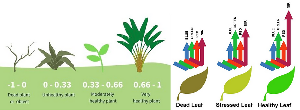
This Vegetation Density information is a vital component of the Landslide Risk Model as dense and healthy vegetation holds the top soil together whereas sparse or unhealthy vegetation makes the top soil more susceptible to crumbling, making it more vulnerable to Landslides.
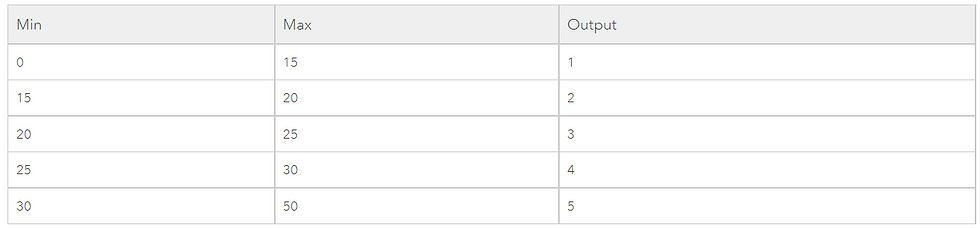
The Remap command applied to all the three input layers helps to classify the pixel values of all the three layers into distinct categories. An example of the classification is shared below-
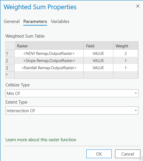
The Weighted Sum part of the processing chain allows me to combine the pixel values of all the three Remapped layers into a new weighted value layer.
For this Landslide Risk Model, I've assigned the NDVI layer a higher weightage - 50% of total as depicted in Figure 10, whereas the remapped Slope and Rainfall pixel values have been assigned a weightage of 25% each respectively. This is because of the recent Wildfire incident, which would make lack of vegetation the most important causative factor for a Landslide to occur.
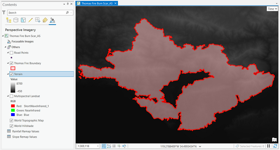
With the INT command, I are asking the GIS software to truncate the weighted pixel values into integers and with the Clip command, I will restrict the geographic extent of the Landslide Risk Model (integer-ized weighted value layer) to just the Burn Scar i.e. the region impacted by the recent Wildfire which is our Area of Interest (AoI).
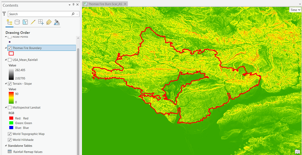
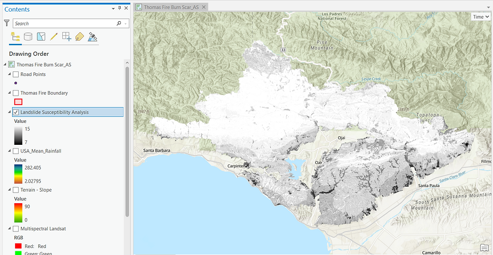
Upon executing the Processing Graph, the output that is generated is depicted in Figure 10 below. As can be seen in the symbology pane, the Burn Scar risk scores range from a minimum of 7 (black pixels) to a maximum of 15 (white pixels). The larger the risk score, the higher is the possibility of a Landslide occurring at that location.

I hope you were able to appreciate how Geospatial Technology was deployed to process multiple input data layers into a Landslide Risk Model - the processing speed is rapid and occurs at the click of a button. As I never fail to emphasize, the quality of geospatial data is as important as the geoprocessing prowess of the GIS software.
Workflow 2: Analysing a Model to identify at-risk populace
Let me perform a basic analysis on the Risk Model generated in the previous workflow. For a Road that traverses the Burn Scar, I've queried the GIS software to mark those spots on it where the Landslide Risk score is >12 i.e. very high-

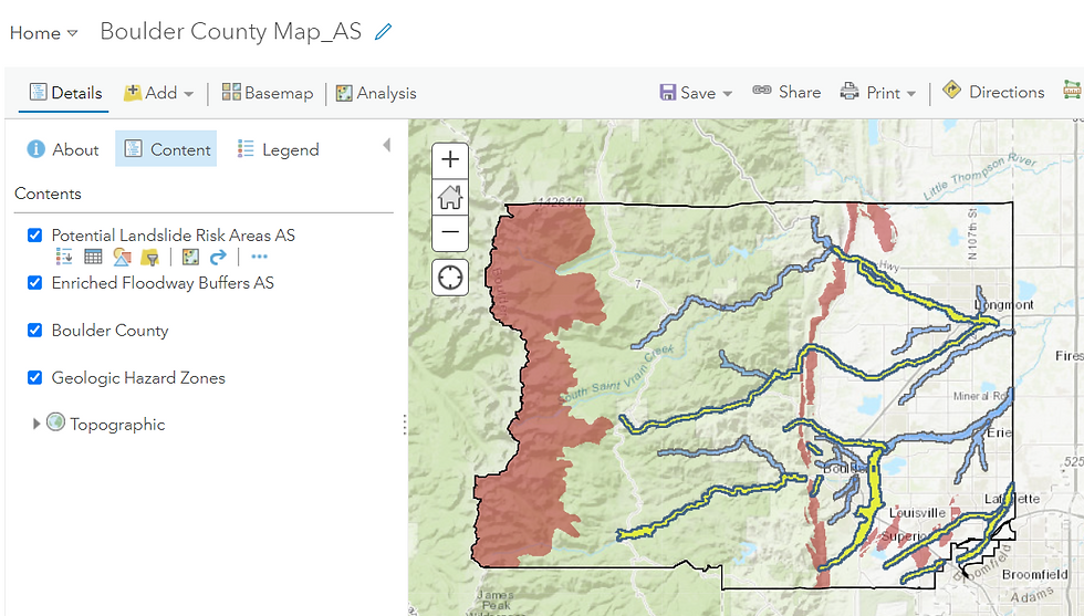
For this workflow, I will analyse an already-prepared Landslide Risk Model for Boulder County in Colorado, USA to identify those resources that face a potent threat from Landslides in the future, considering a Wildfire event that has recently occurred in this region and given the fact that Landslide is at its most threatening not at its origin but when a mass of mobile debris accumulate on a steep downslope (Much thanks to Learn ArcGIS for the training resources).
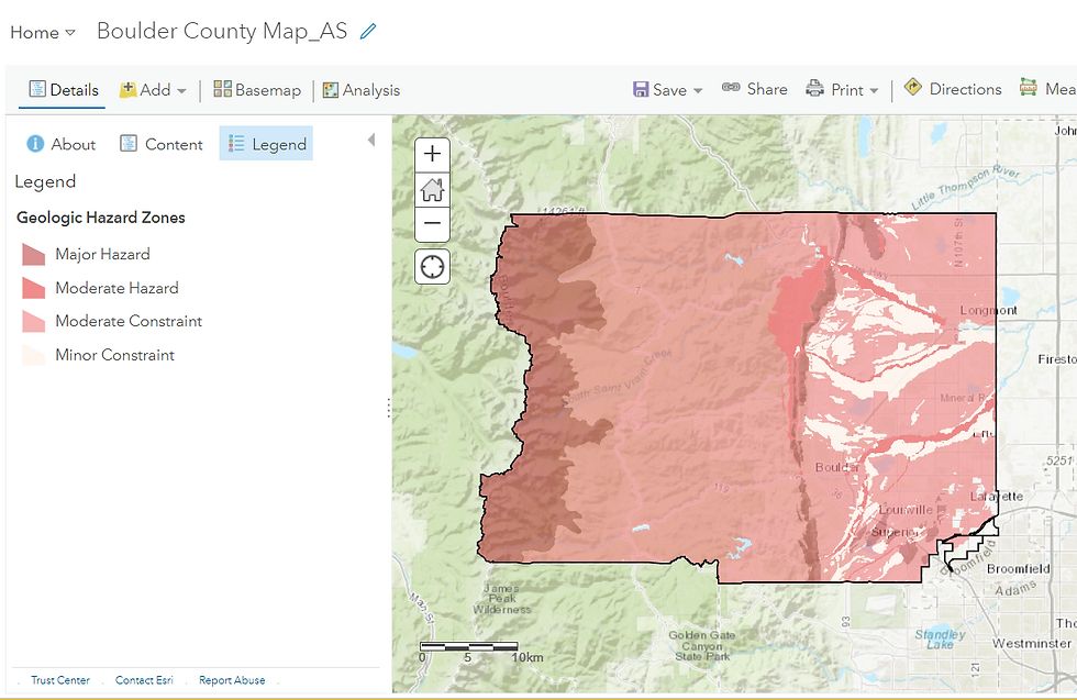


Let me hover around a few urban centres within Boulder County....
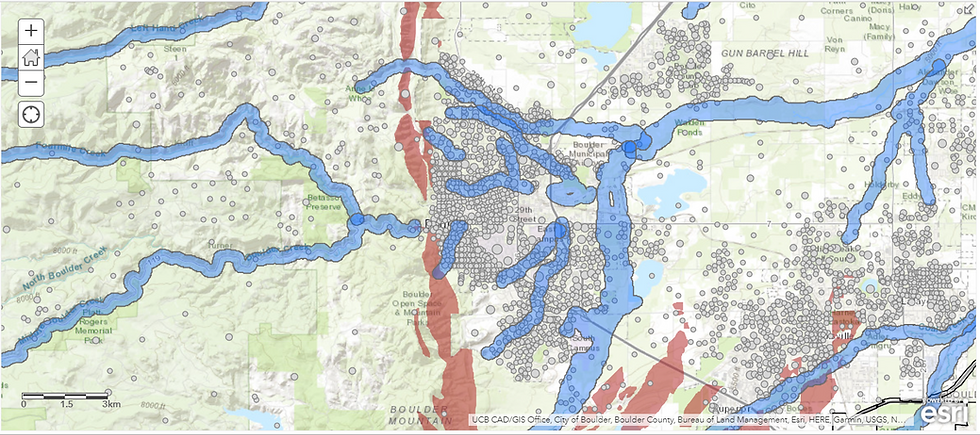

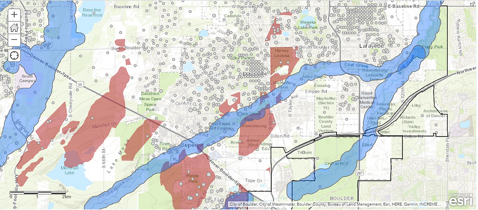
The Enrich geoprocessing tool would allow me to add authoritative demographic and socio-economic data of Boulder county (available within the GIS software) to my project-


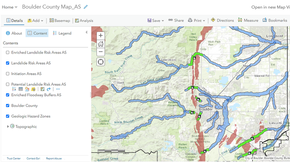
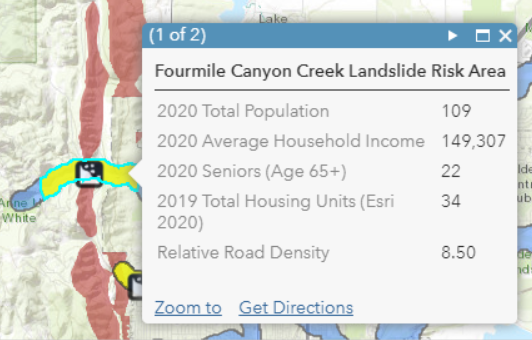
These Green zones are the prime areas of concern. Besides Population, one can enrich the project with other relevant datasets such as Housing units, Property Density, Road Density and number of Elderly persons - this would help the rescue and relief authorities to prioritize their action plan in the eventuality of a Landslide.
To summarize, I've analyzed the Landslide Risk Model to identify resources at the highest risk.
Workflow 3: Detection of Landslide using Radar Remote Sensing
While the previous two workflows involved demonstrating the creation of an Early Warning System and analysing it to identify at-risk populace, in this third and final workflow, I will demonstrate how to detect a Landslide location using Sentinel-1's Synthetic Aperture Radar or SAR Satellite Imagery.
(Just like the previous workflows, this will be a pictorial demonstration - if you are interested in seeing the actual workings on SNAP software - you may view this video tutorial. Much thanks to RUS Copernicus for the training resources).
You may posit that in the modern era that we live in, Landslides are already being detected and that too very quickly - reports and footage are quickly captured and circulated on social media within a matter of mere minutes. That being said, knowing the origin and extent of Landslide in a hilly, flooded or a remote terrain is difficult, particularly if there are no human settlements in the vicinity.
The process of detecting Landslides entails analyzing two SAR Imagery datasets over the same geographic extent and close to each other in terms of timeline (Sentinel-1 Satellite constellation, the source of the SAR Imagery that I've used, has a high temporal resolution i.e. revisit time of between 6-12 days) albeit pre and post the day(s) of Landslide monitoring. The technical term for this type of analysis is InSAR or Interferometric Synthetic Aperture Radar and the fundamental step in the process of detecting a Landslide involves observing whether there is a change in the shape and position of surface features i.e. the occurrence of Ground Deformation between both the images.
Radar Imagery has certain characteristics which make it more conducive for the rapid detection of Landslides than Multispectral Imagery. For starters, its long wavelengths are able to penetrate clouds and atmosphere with ease and the Imagery can be acquired during night as well due to the source of illumination being present onboard the Satellite itself (Microwave transmitters). Multispectral Imagery, on the other hand, is captured passively - the source of illumination being the Sun - and hence, it can only be acquired during the day. Evidently, atmospheric constituents such as clouds and aerosols also act a major impediment for the short wavelengths of sunlight.
The Microwaves that reflect back towards the satellite (technically called as Radar Backscatter) carry valuable information regarding surface roughness (particularly useful for Landslide Detection) whereas through Solar Radiation, one can only obtain (predominantly) a direct representation of visual appearance which is more useful for validating the Landslide detected by SAR rather than detecting the Landslide itself.
The study area for this workflow is Fagraskógarfjall in Iceland - this mountainous area had received unusually high rainfall during the first week of July, making it a ripe candidate for Landslide. The two SAR images that I will use for Landslide detection have been acquired on 23rd June 2018 (pre rainfall) and 17th July 2018 (post rainfall) respectively.
I have explained each the steps of this complex processing chain (InSAR Interferometry) in detail in another post - Deformation Mapping for Volcanoes - which you may read there should you be interested in having a more in-depth understanding of the technicalities. In this already-very-long-post, I will only be sharing a summary-
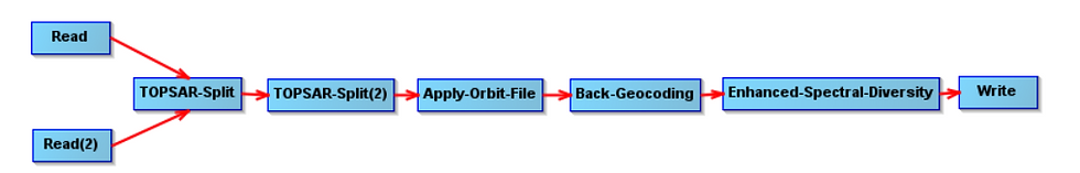
The objective of this first part of the processing chain (as depicted in Figure 26) is to make the two SAR Satellite Imagery datasets cleaner and comparable. The output is a Coregistered Stack (processed pre and post datasets combined in a single product to facilitate pixel-to-pixel comparison).
Below is a RGB composite visualization of the Coregistered Stack-

In order to interpret the RGB composite, know that the Yellow pixels denote where both the pre and post Imagery datasets have received similar amounts of Radar Backscatter, the Red pixels denote where there is a higher Backscatter in the pre Imagery dataset, the Green pixels denote where there is a higher Backscatter in the post Imagery dataset and the Black pixels denote where there is zero/negligible Backscatter (these are likely to be water bodies as such smooth surfaces reflect microwaves away from the Satellite i.e. in the opposite direction, due to Specular Reflection).

The next step involves deploying the Interferogram operator whose output will help me to detect Deformation and measure the rate of Ground Displacement (the rate of Uplift or Subsidence) between the pre and post Imagery datasets, with centimeter-level accuracy.

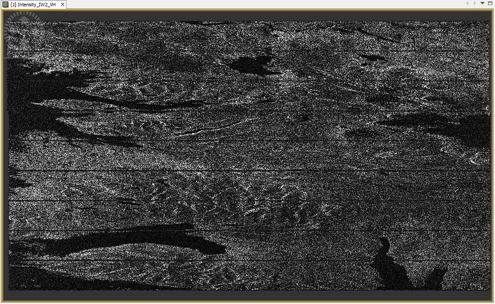
The three interferometric outputs generated are the Intensity, Phase and Coherence bands-
Intensity - In a single raw SAR Imagery dataset, the Intensity value of a pixel is the square of the Amplitude where Amplitude is the reflected microwave energy from the Earth's surface, originally transmitted by and subsequently captured by the satellite itself. In the Interferometric output however, the Intensity value is derived by multiplying the Amplitude values for the same pixel across both the pre and post images within the Coregistered Stack.
Phase - In a single raw SAR Imagery dataset, the Phase value is a modified representation of the distance between the satellite's antenna and the ground target. As I am seeking to measure Displacement (the rate of Uplift or Subsidence), it is the change in Phase between both the images that would matter to me. The interferometric Phase band is exactly that - it captures the Phase difference i.e. derived by subtracting the Phase value of a pixel in in one image from that in the other. This interferometric Phase output is what is known as an Interferogram.
Coherence - Coherence is a measure of interferometric quality and is a normalized value ranging from 0 to 1 derived by combining the raw Amplitude and Phase values across both the SAR Imagery datasets. If the Amplitude values of the same pixel across both the Imagery datasets are similar and the Phase values of the same pixel are similar too, then the computed Coherence takes a value closer to 1 i.e. very high Coherence. If the Amplitude and/or Phase values across both the datasets are dissimilar, then the Coherence value diminishes towards 0 i.e. very low Coherence. What a deformation researcher is keen to observe in the interferometric output is cluster(s) of pixels with low Coherence, a telltale sign of Deformation.
What I am essentially seeking to do through this Interferometric processing chain is to detect and compare the change in surface features using, in particular, the Phase and Coherence information. These would help me ascertain the presence of Deformation which in turn will validate the occurence of Landslide at that location (besides Landslides, Deformation Mapping is also utilized in Volcano and Earthquake monitoring workflows, among others).

The loss-of-Phase that you are witnessing in our area of interest on the left visual in Figure 30 above - a rippling disturbance akin to throwing a pebble in calm waters - is indicative of Ground Displacement to have occured between both the imagery acquisitions, a telltale sign of Deformation which intensifies our speculation of this location being impacted by a Landslide.
Likewise, in the right visual, the cluster of black pixels in our area of interest denote low Coherence values (near 0) - indicative of a significant shift in surface features between both the imagery acquisitions. Together with the loss-of-Phase evidence, the low Coherence evidence virtually confirms the occurrence of a Landslide at this location.
And from the Slider below, where I have used a natural-colored Multispectral/Optical Satellite image to compare the area of interest with low Coherence values, it becomes absolutely clear that a Landslide has occured here (it is the site of the massive Fagraskógarfjall Landslide which occured on the morning of 7th July 2018)-
Slider 1: Using Multispectral Satellite/Aerial Imagery to validate the detected Landslide location in the Interferometric Coherence Output
Fascinating, isn't it?
To summarize, the Landslide location was systematically confirmed from SAR Imagery through-
Cluster of Green pixels (indicating high Backscatter in post image) in the RGB Composite of the Coregistered Stack of processed pre and post images
Higher Intensity values at the same location in the post SAR image confirming #.1
Loss-of-Phase in the Interferometric output over the same location
Low Coherence in the Interferometric output over the same location
Multispectral Imagery validating the Landslide detection done through Radar Imagery
Not only can this Landslide Detection procedure involving Remote Sensing using Satellite Imagery be done quickly (processing in SNAP software is a breeze with modern GPUs), it is also cost-effective compared to utilizing Ground-based or Aerial techniques.
That being said, when I tried to replicate this InSAR workflow on known, recent Landslide-affected sites in India (Mizoram and Kerala), I was unable to detect the presence of the Landslide - I literally spent several days trying to repeat/alter the procedure in order to eliminate the possibility of human and software error. While this technical note sheds some light on the fallibility of using SAR Imagery for Landslide detection, I can highlight two aspects which served to act as an impediment for me-
Low Spatial Resolution of Sentinel-1 Satellite Imagery: The Interferometric Wide (IW) Swath mode SAR product of Sentinel-1 has a spatial resolution of 5 x 20 meters (1 pixel = 100 square meters). This is only sufficient to detect large Landslide locations - such as Fagraskógarfjall Landslide as demonstrated in this workflow. Higher resolution, albeit 'commercial' SAR satellites would be better suited for detecting Landslides of a smaller spread. These service providers can manoeuvre their Satellite over the Area of Interest on-customer-demand unlike Earth Observation (and free-to-use) satellites like Sentinel-1 which ply on a fixed orbit - this is another important advantage for utilizing their services for the rapid detection of Landslide location.
The Watery Dilemma - As indicated earlier in this post, Water Bodies generate negligible Backscatter due to Specular Reflection - this is a relevant threat for Landslide detection as one of the major factors causing Landslides is heavy rainfall and ensuing flooding downslope. Thus, if one were to select the pre and post images around this time period, the backscatter values would show limited contrast thereby impeding the detection of Landslide and causing it to remain unnoticed.
The Mizoram and Kerala sites are prone to heavy-rainfall virtually throughout the year and this aspect also hampered Landslide detection through InSAR. Ideally, one should select both the SAR Imagery datasets that are acquired during dry spells in order to put oneself in the best position to ascertain ground deformation. This, as you would realize, is not only a challenge but also is self-defeating to the purpose of Rapid Landslide detection.
Hope you enjoyed exploring the Landslide Hazard Mapping Workflows involving Risk Modeling, Analysis and Detection covered in this post! Feel free to share your thoughts and feedback.
ABOUT US
Intelloc Mapping Services, Kolkata | Mapmyops.com offers Mapping services that can be integrated with Operations Planning, Design and Audit workflows. These include but are not limited to Drone Services, Subsurface Mapping Services, Location Analytics & App Development, Supply Chain Services, Remote Sensing Services and Wastewater Treatment. The services can be rendered pan-India and will aid your organization to meet its stated objectives pertaining to Operational Excellence, Sustainability and Growth.
Broadly, the firm's area of expertise can be split into two categories - Geographic Mapping and Operations Mapping. The Infographic below highlights our capabilities-

Our Mapping for Operations-themed workflow demonstrations can be accessed from the firm's Website / YouTube Channel and an overview can be obtained from this brochure. Happy to address queries and respond to documented requirements. Custom Demonstration, Training & Trials are facilitated only on a paid-basis. Looking forward to being of service.
Regards,


